Redesigning the Island Finance experience meant balancing real user frustrations with internal constraints that shaped what was possible. Together, these informed every design decision.
💻
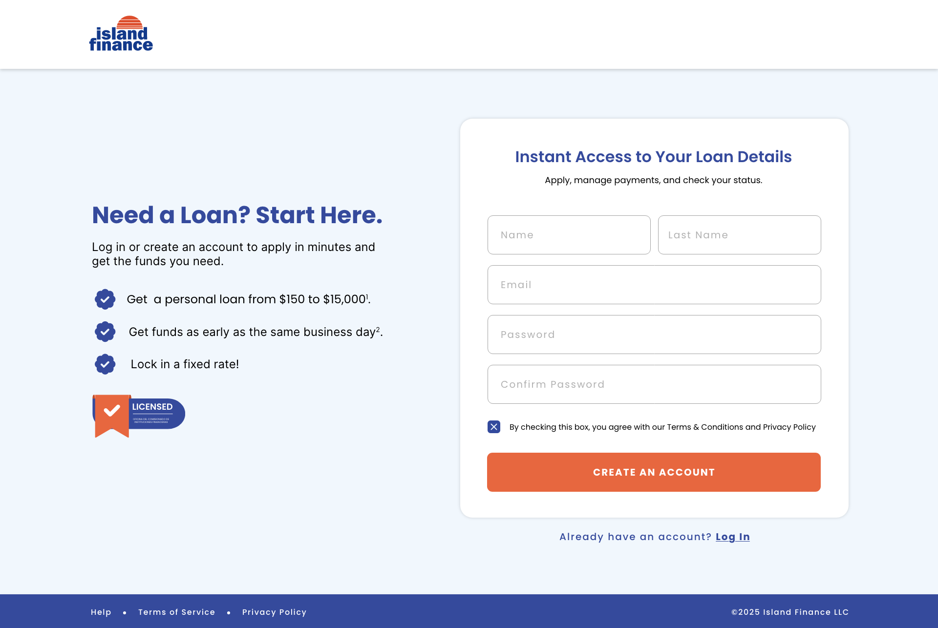
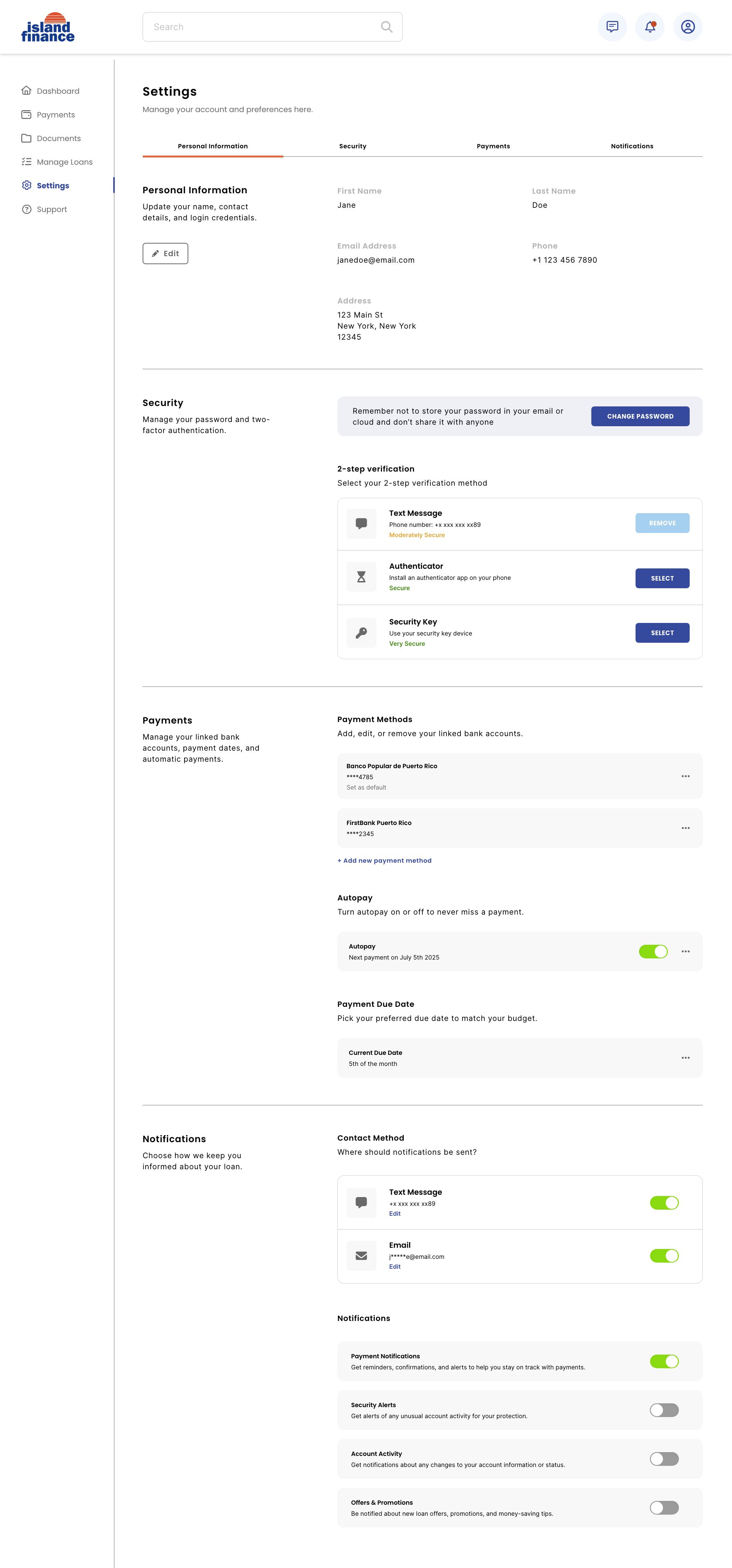
Trust & Credibility
An outdated website and unreliable IT services raised red flags for clients, signaling a lack of professionalism. Every screen had to counter that through clean layouts, upfront fee explanations, and clear action feedback that rebuilt confidence in the platform.
📚
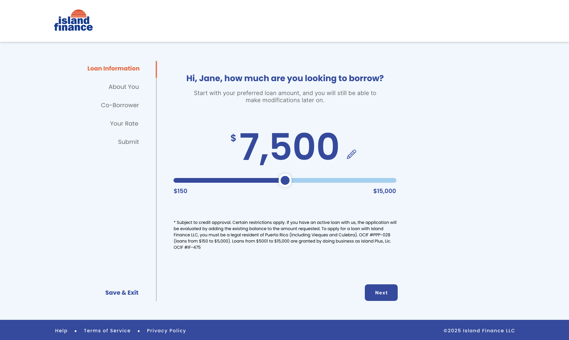
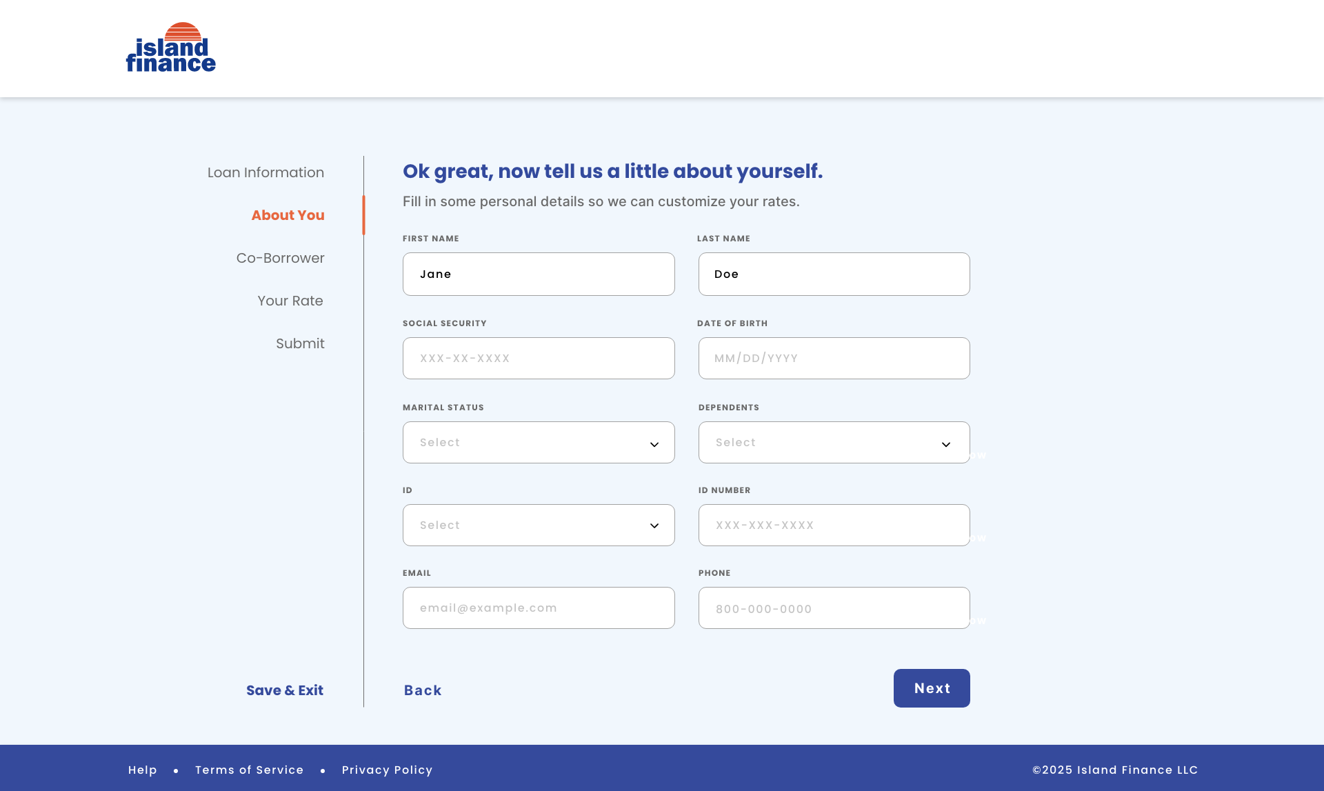
Financial Literacy
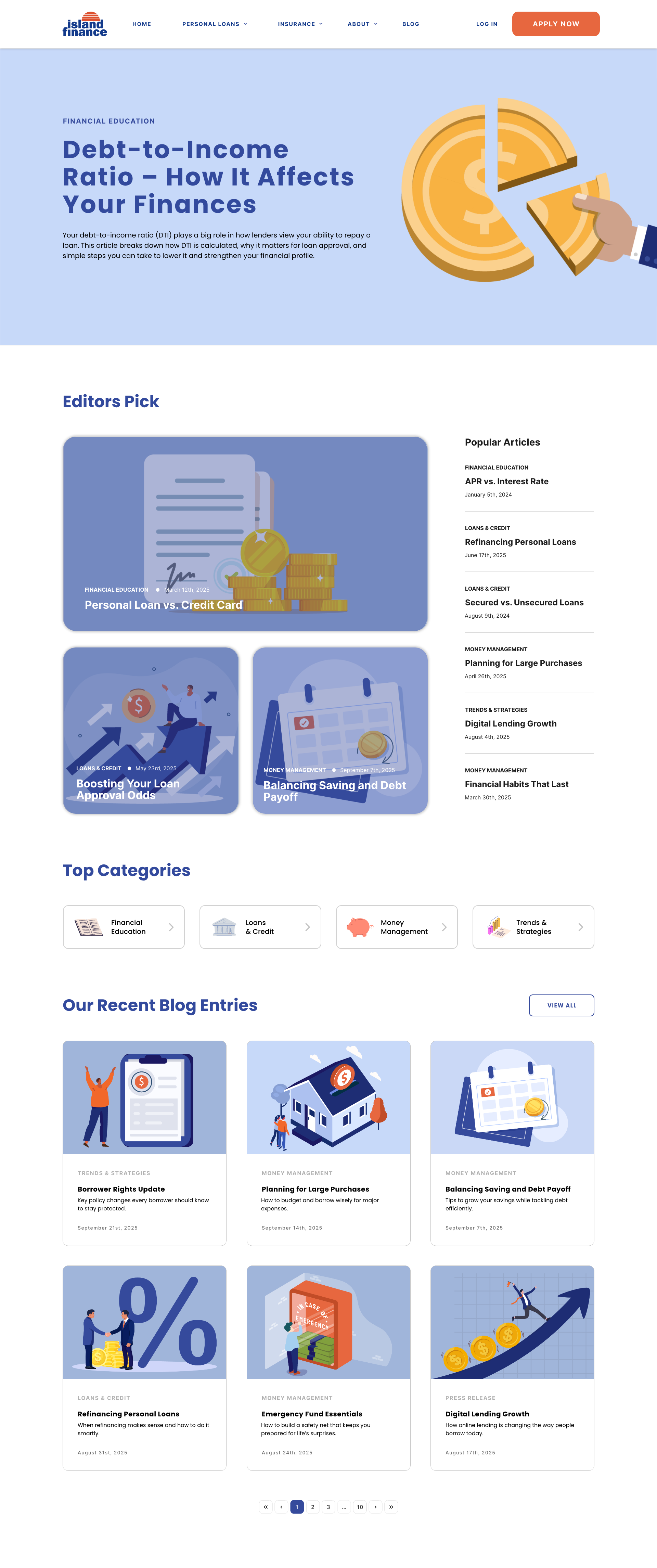
Low financial literacy makes the loan process confusing and overwhelming. Rather than just presenting information, we designed the experience to guide and teach using plain copy and step-by-step flows to reduce overwhelm and encourage more responsible borrowing.
🤝
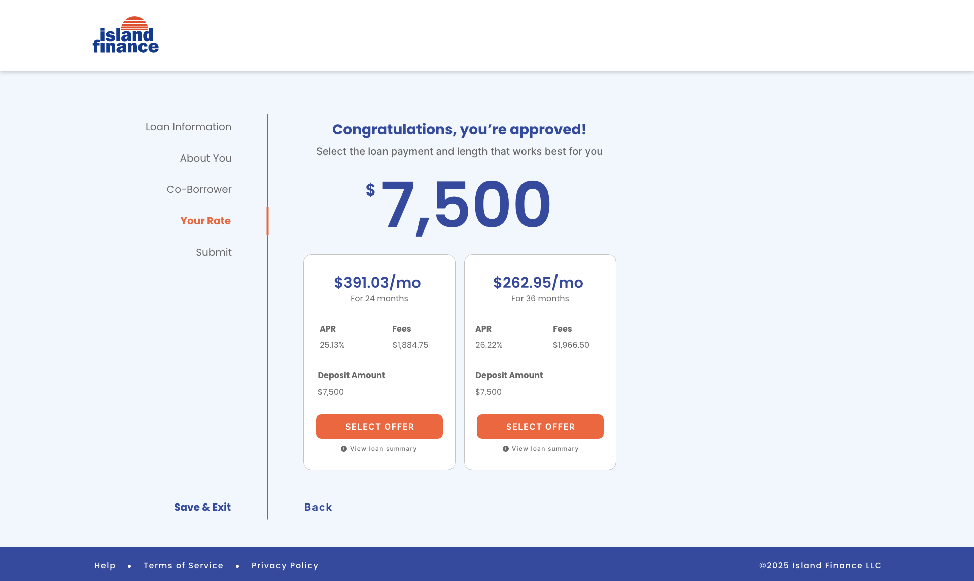
Transparency
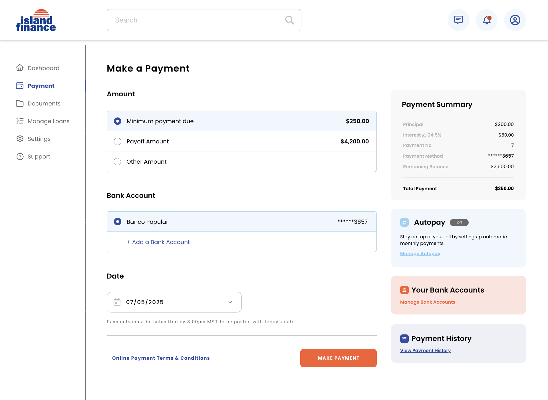
Fear of hidden fees and unclear terms slows down decision-making and drives potential borrowers elsewhere. We made disclosures and loan terms a natural part of the flow, keeping things clear and compliant without feeling cold or bureaucratic.
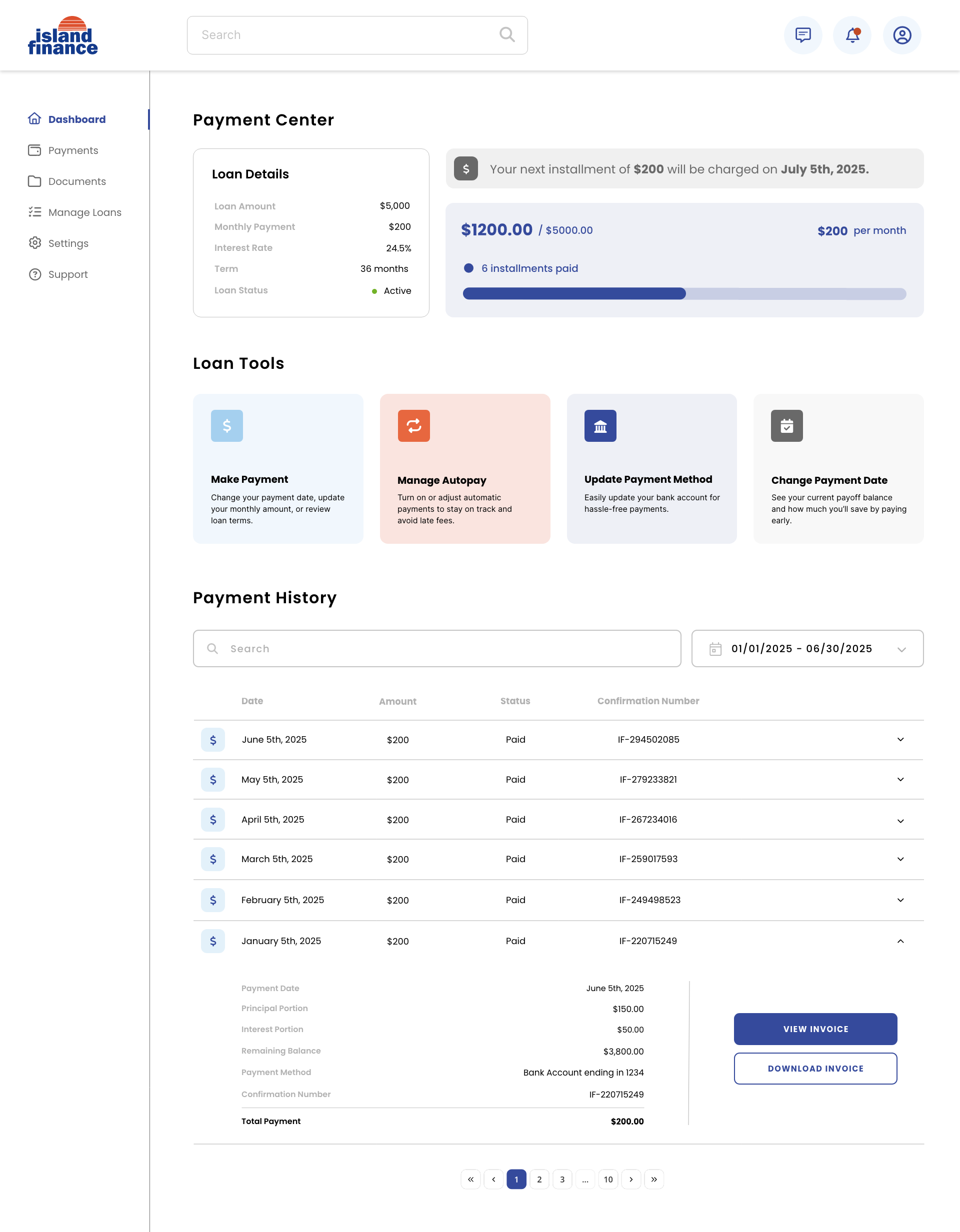
📱
Digital Loan Management
Without the ability to manage loans digitally, the experience feels outdated and frustrating. Legacy infrastructure limited how far we could go, so we prioritized simple, scalable solutions that gave customers real convenience without requiring deep backend overhauls.