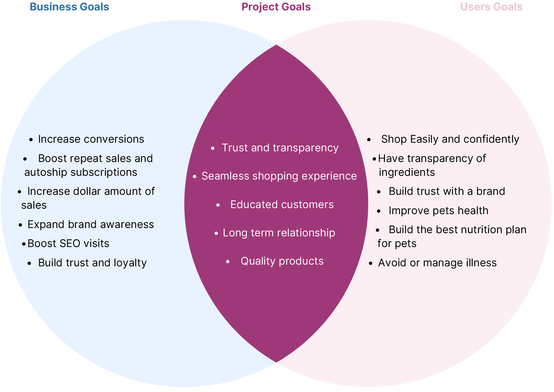
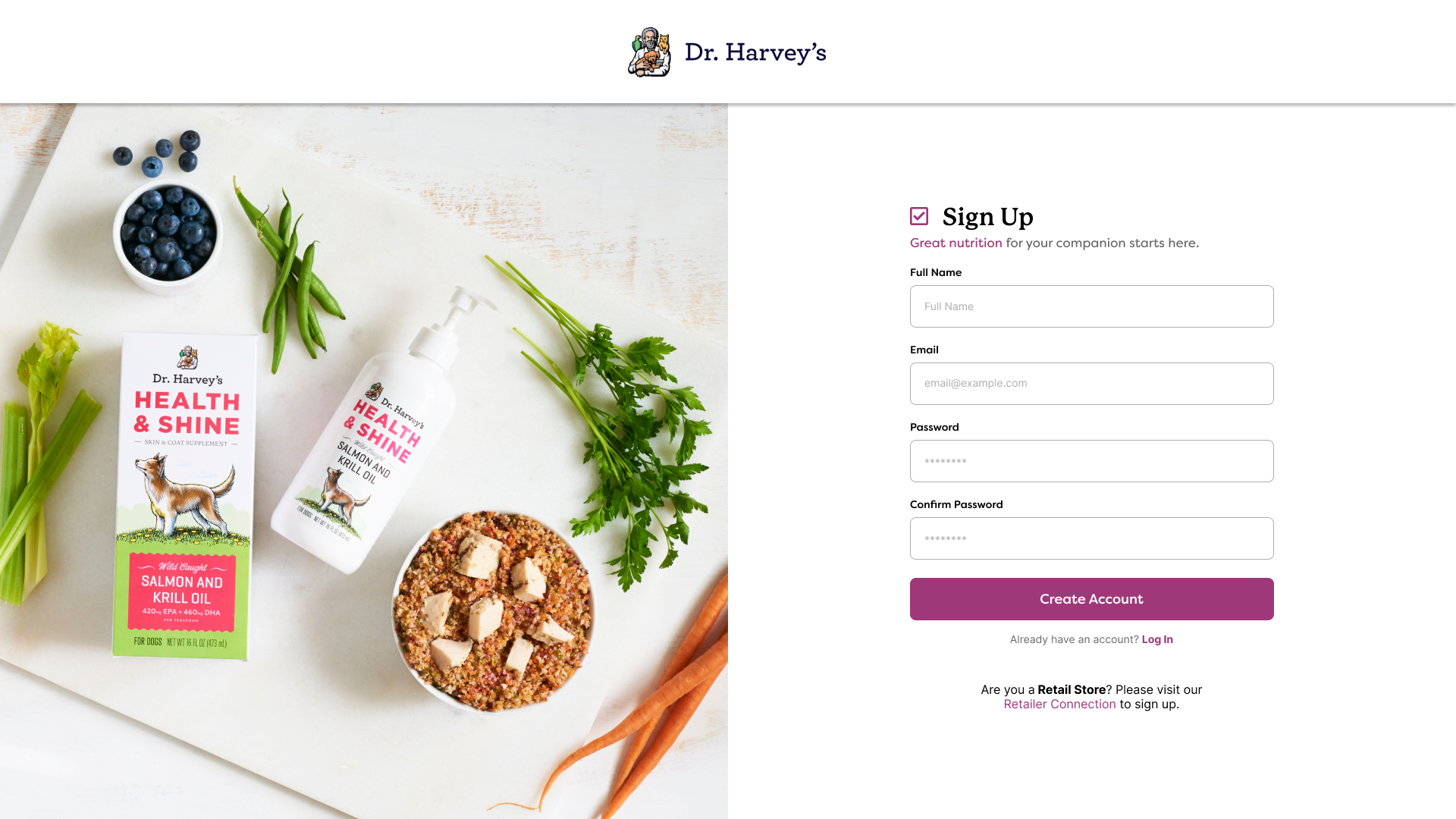
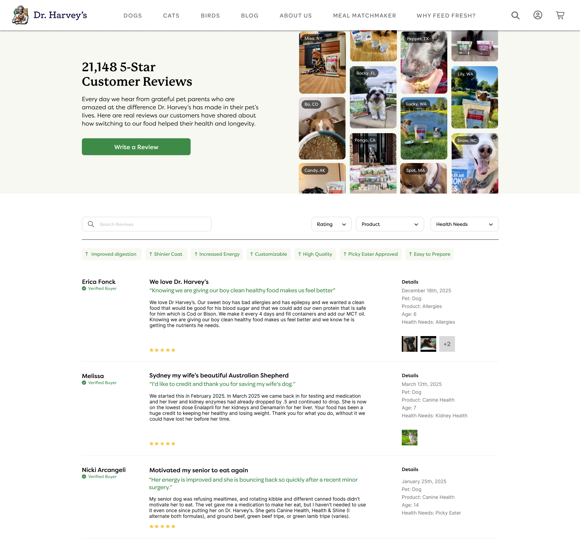
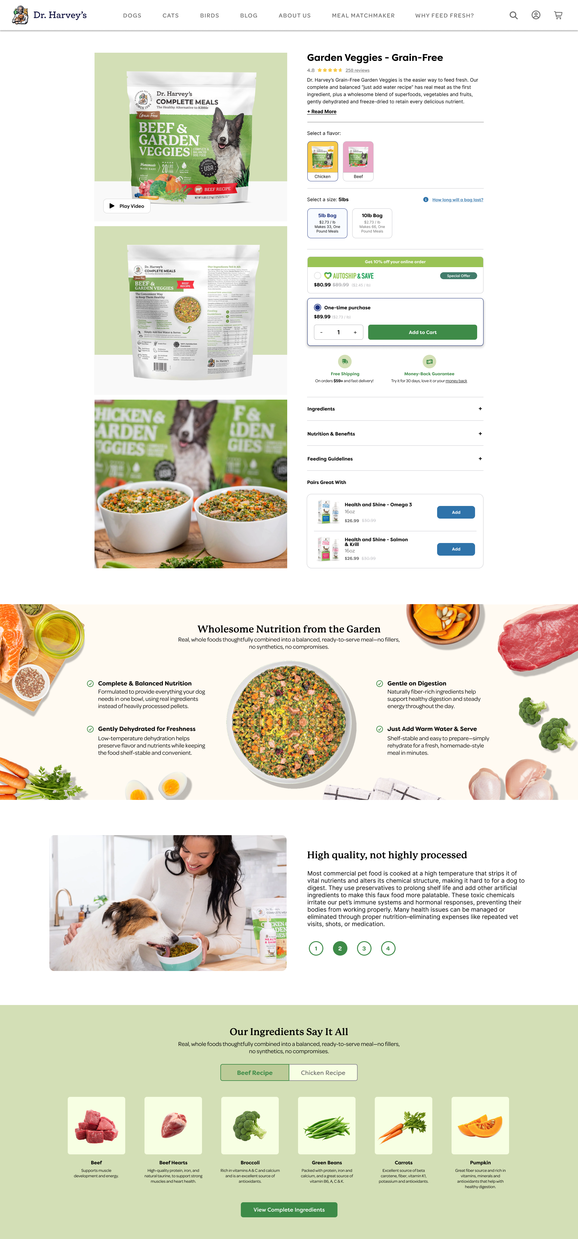
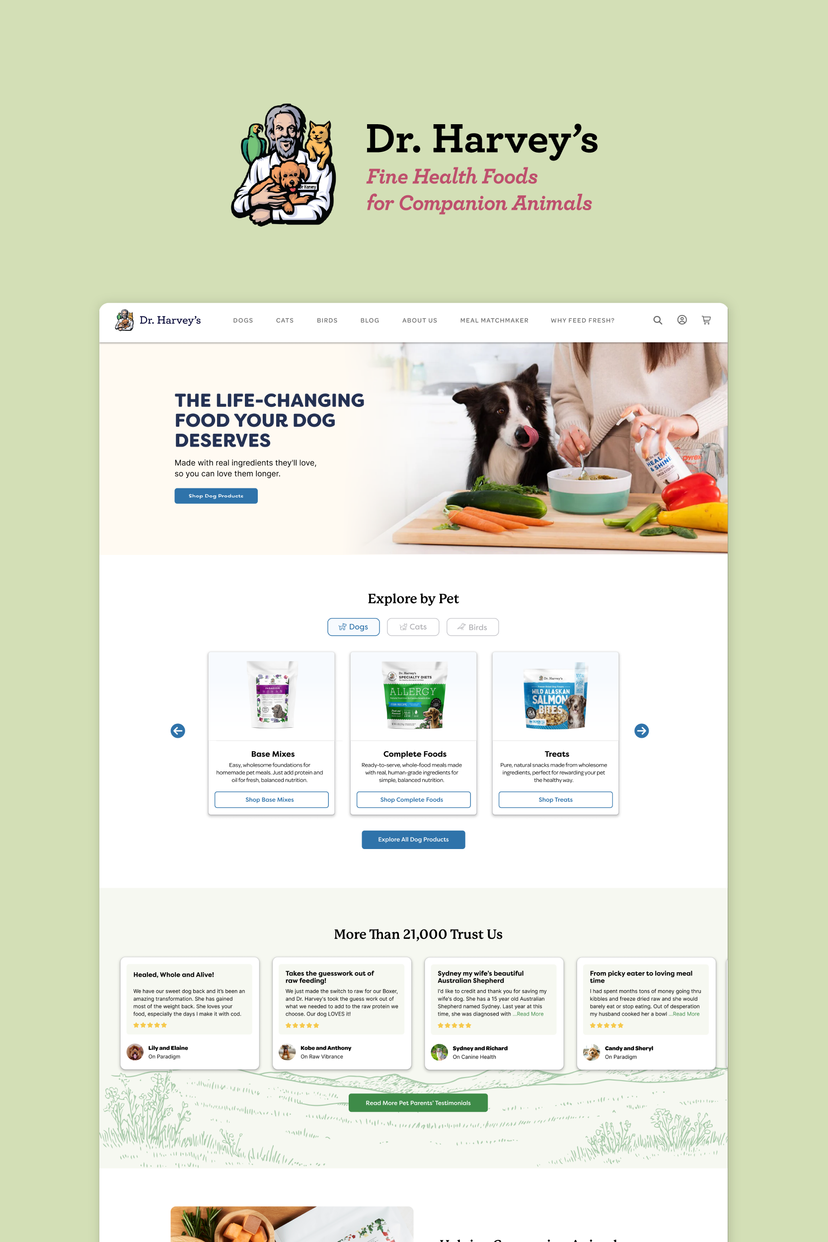
Dr. Harvey's

Role

UX Researcher, UX/UI Designer, User Testing, Front End Developer

Industry

Pet Food & Supplies, E-commerce

Tools

Figma, VWO, RubyMine

Languages

Haml, Sass, Javascript

Dr. Harvey's was founded in 1980 by Dr. Harvey Cohen, a holistic nutritionist and lifelong animal lover. He created the company to offer all-natural, human-grade pet food without preservatives or artificial additives, which was groundbreaking at the time.

More than 40 years later, Dr. Harvey's remains a family-owned business that provides holistic pet products focused on real, whole-food ingredients, nutrient-rich formulas, and transparent sourcing. The company is dedicated to helping pet owners make informed choices for their pets' health and wellbeing.

To stay competitive in the growing holistic pet food market, the website was modernized to improve usability and visual appeal while keeping the handmade feel that reflects the brand's values. The project focused on increasing conversions with transparency and trust, avoiding aggressive sales tactics, and creating a welcoming, authentic experience for pet owners who value natural and honest products.

Note: Most copywriting and visual assets (graphics and illustrations) were handled by the client's graphic design and marketing teams. I also collaborated with a full-stack developer to implement and refine several front-end features.

Snapshot

The User

Dr. Harvey's target audience is health-conscious pet owners who treat their animals as an extension of their own wellness lifestyle. The core buyer is a Millennial or Gen Z pet parent, aged 18–38. They're skeptical of conventional options, willing to pay a premium for clean-label, human-grade ingredients, and quick to do their research before buying. Higher-income households round out the audience, drawn in by the brand's transparency and premium positioning. What ties everyone together is a distrust of processed food, a demand for clean labels, and a genuine belief that better nutrition means a healthier, longer life for their pet.

Snapshot

The Problem

This audience have high standards and low tolerance for anything that feels generic or salesy. They want enough information to feel confident but not so much that the page feels overwhelming. Trust has to be built visually, not just through copy, and since most of them are landing from social on mobile, the experience needs to hold up on a small screen. The challenge is making a handcrafted, ingredient-driven brand feel premium online without losing the warmth that makes it feel different.

Snapshot

The Importance

This redesign aimed to bring Dr. Harvey's digital presence in line with the premium, natural product it's known for. Beyond modernizing the look, it was an opportunity to build trust faster, speak more clearly to a health-conscious audience, and create an experience that holds up through mobile, where most buyers are discovering the brand.

Competitive Audit

Understanding the market

To understand how Dr. Harvey's compares within the pet nutrition and wellness space, we conducted a competitive audit of both direct and indirect competitors. The analysis focused on presentation, features and educational content. This helped reveal common strengths, areas where competitors fell short, and opportunities for Dr. Harvey's to stand out.

User Research

Understanding users

To better understand the needs and behaviors of users interested in holistic pet nutrition, we analyzed industry research, customer feedback shared with Dr. Harvey's, and insights from past user testing. Here are the main conclusions:

Clarity

Users want clear, simple guidance on how to prepare and serve the products. Many feel uncertain about portions, mixing instructions, or how the food fits into their pet's routine.

Emotional Connection

Buyers want to feel emotionally connected to the brands they choose. They're drawn to authenticity, care, and shared values around pet wellbeing.

Ingredients

Users often check the ingredient list first to see what's in the product. This shows the importance of displaying ingredients near the top of the page and keeping them easy to find to build trust.

Trust Signals

Users look for reassurance early in their journey. Visible trust signals such as certifications, vet endorsements, and customer reviews help them feel confident before exploring further.

Challenges

Problem Statement

Many shoppers do not fully understand what holistic pet food is or why it costs more than conventional options. Dr. Harvey's products are not an impulse buy but an intentional investment in a pet's long-term health, usually chosen after careful research and consideration. The challenge was to redesign the website to communicate this value clearly while keeping the brand's authentic, handcrafted feel. The site needed to make ingredient information, feeding guides, and educational content easy to find and search-friendly, helping new customers feel informed and confident. At the same time, the user experience had to support higher conversions and repeat purchases through clear, honest flows and thoughtful upsells, never resorting to pushy tactics. Finally, the mobile experience needed to be seamless, so loyal customers could easily reorder and manage their accounts anytime, anywhere.

Challenges

Main Concerns

Authenticity

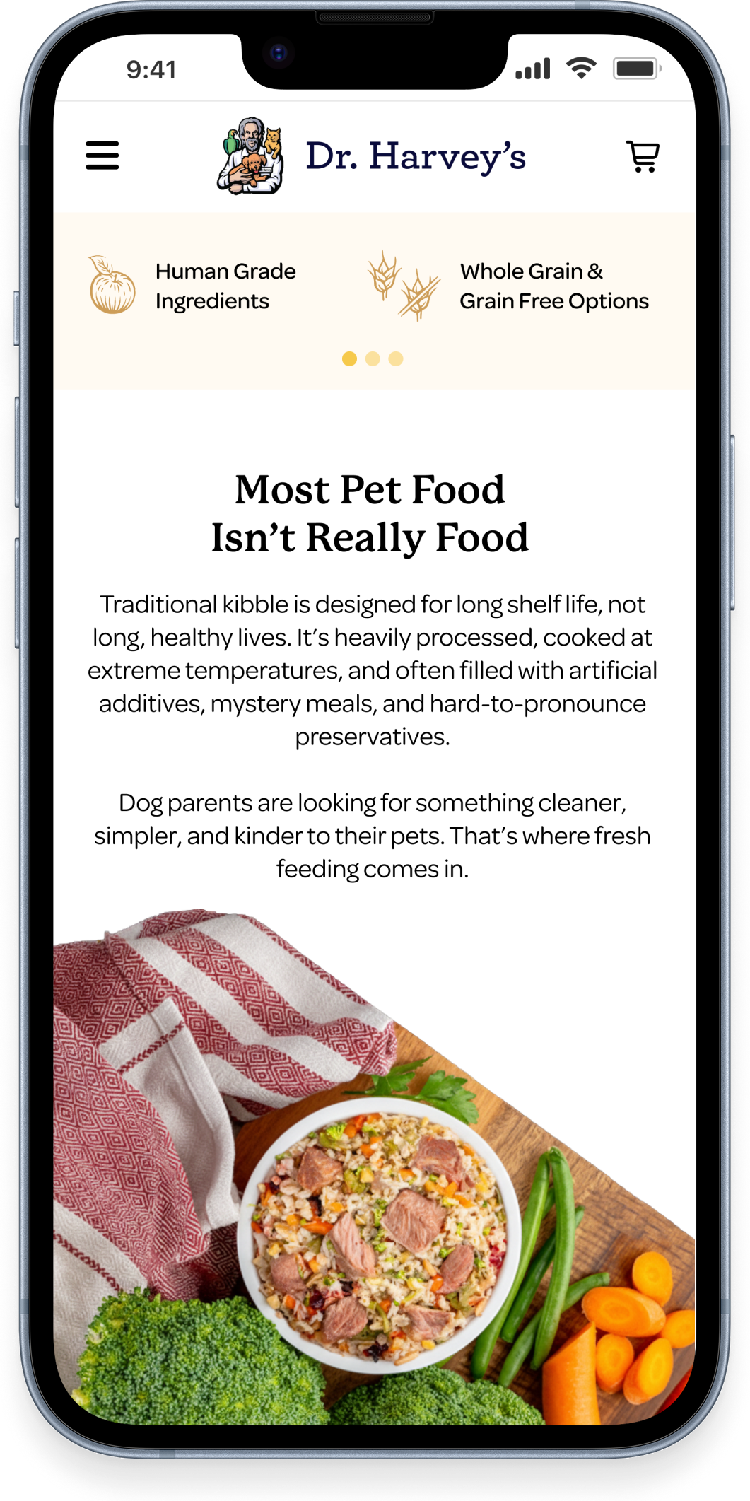
The design needed to feel warm, personal, and craft-inspired, not overly slick or generic, helping create a tone that feels personal, compassionate and transparent to build loyalty and turn purchases into a relationship rooted in trust.
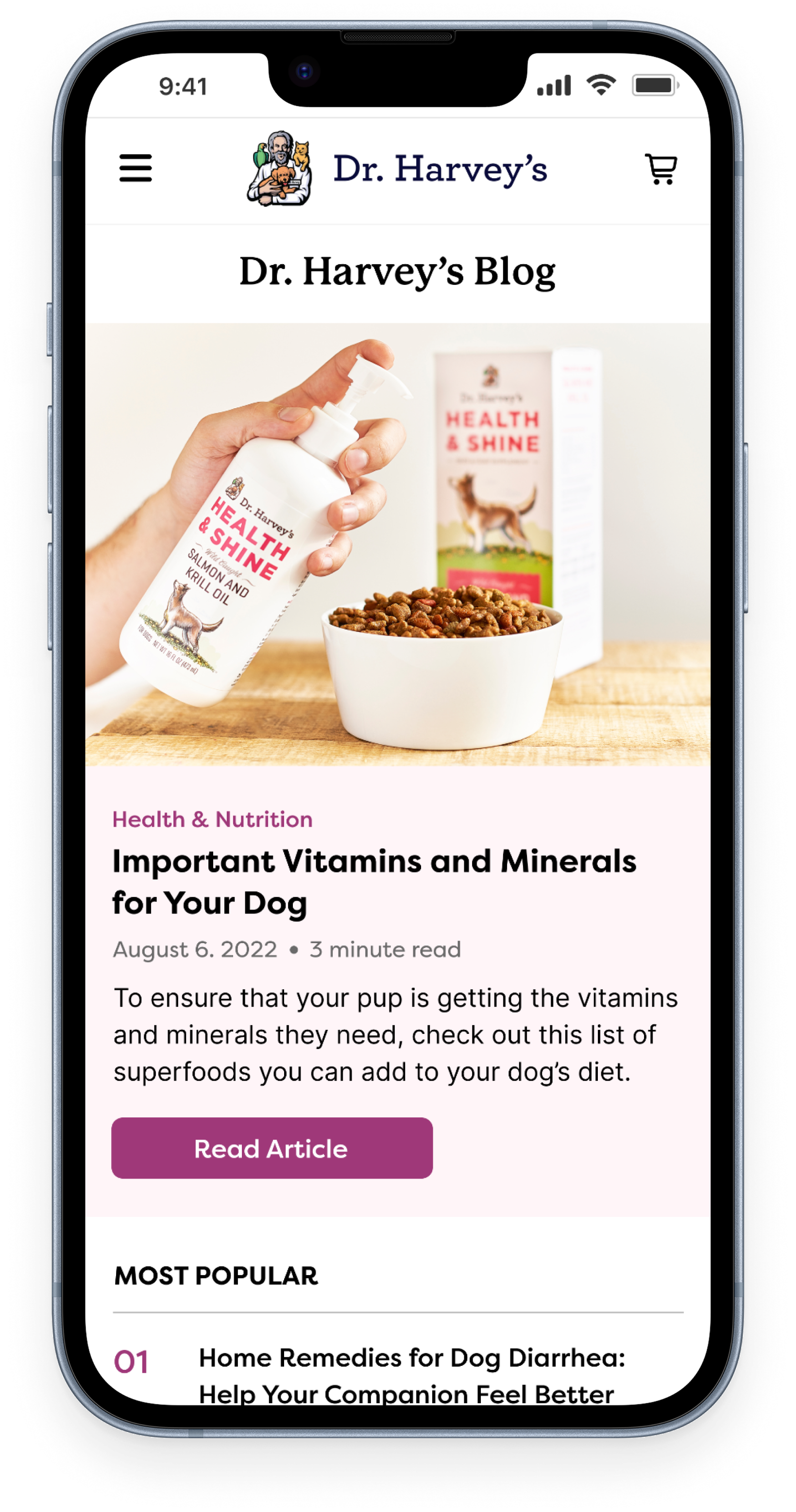
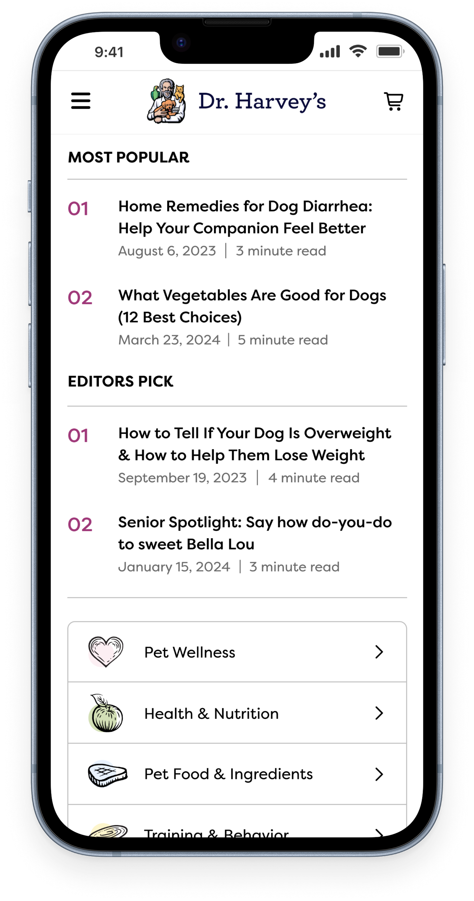
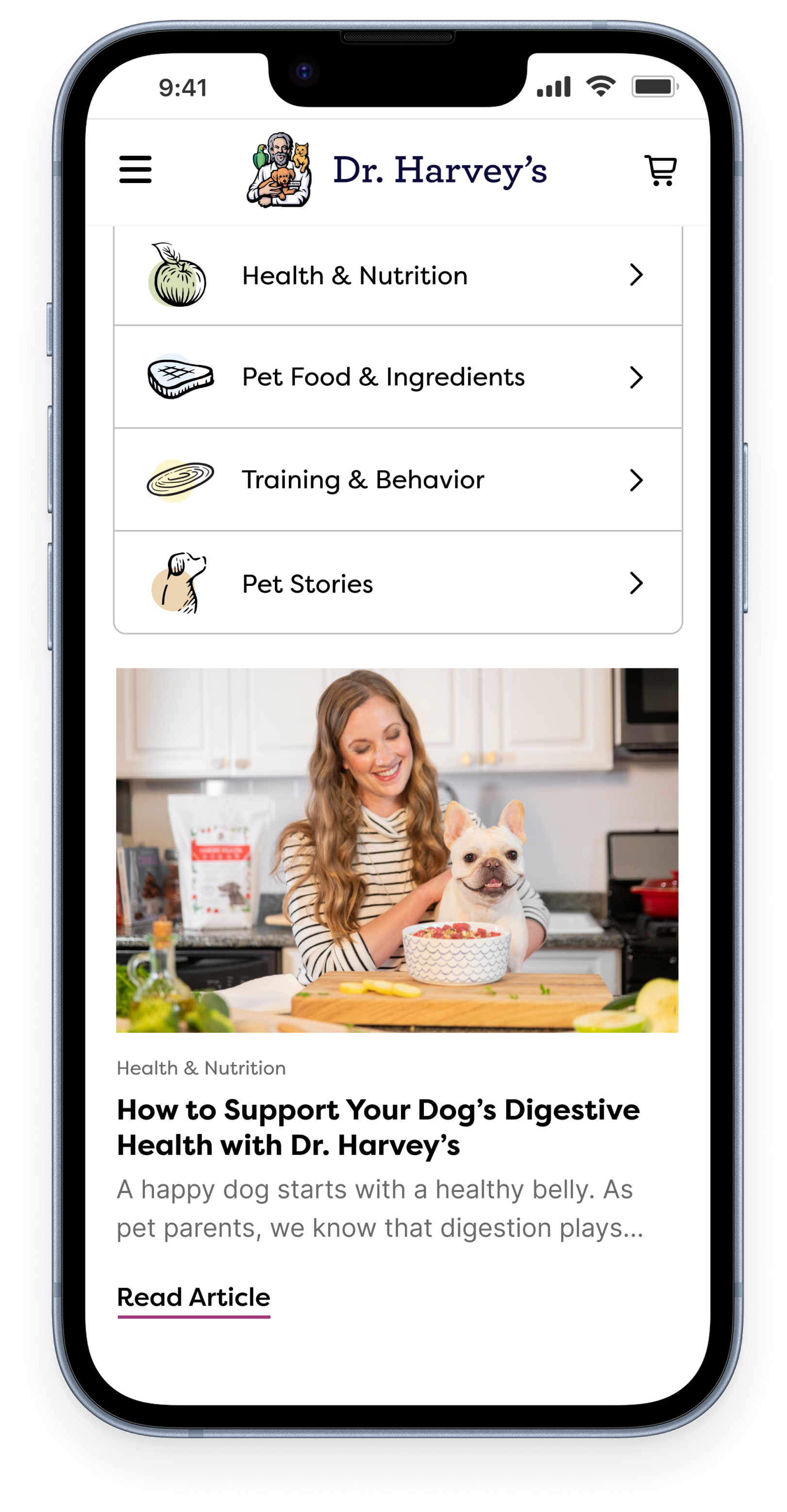
Education

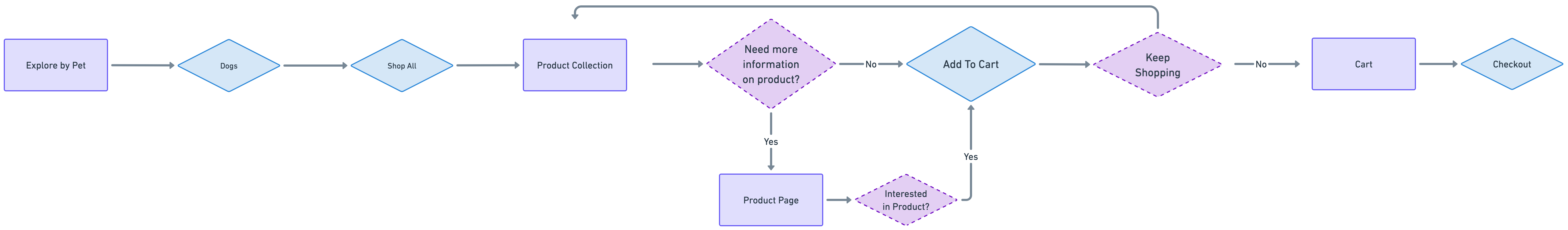
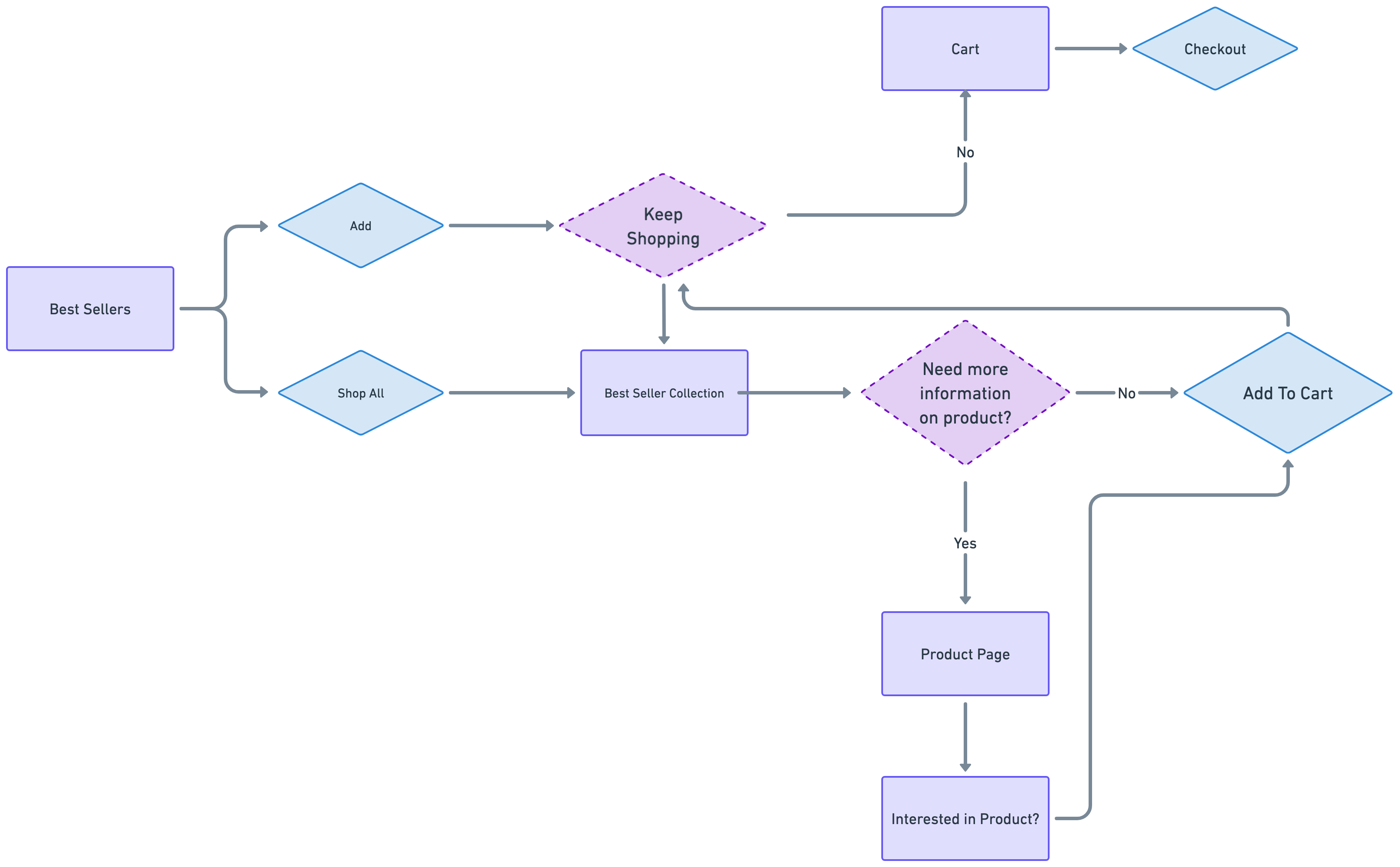
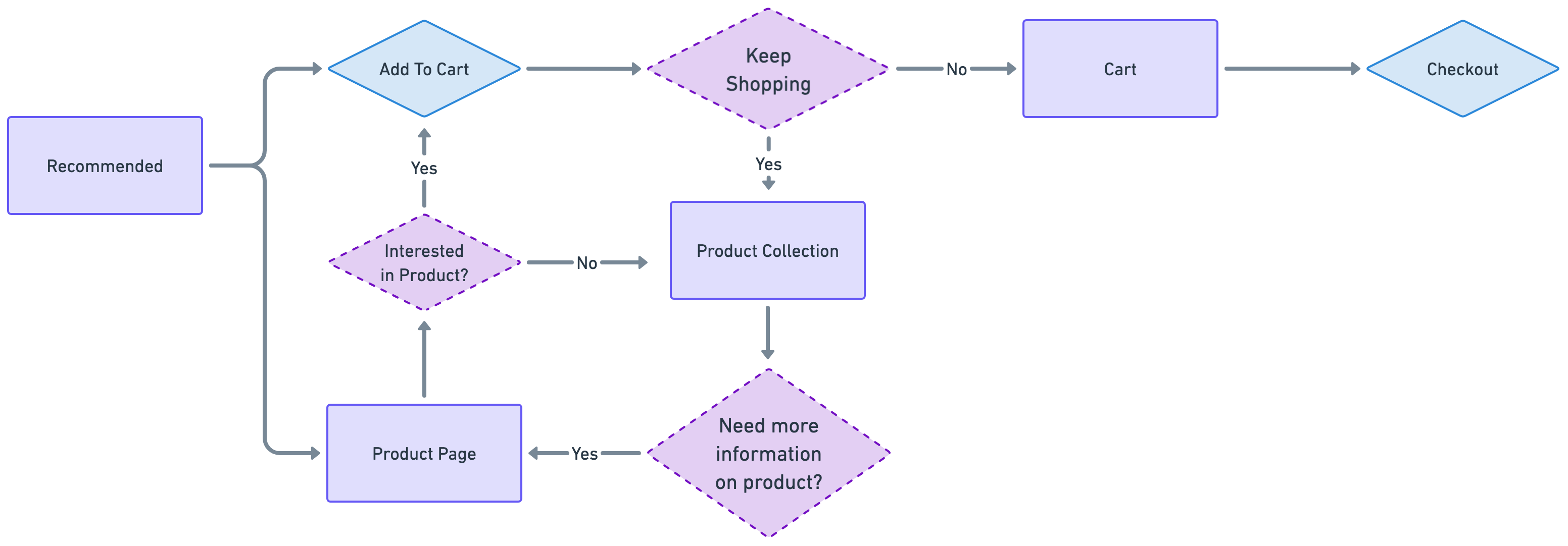
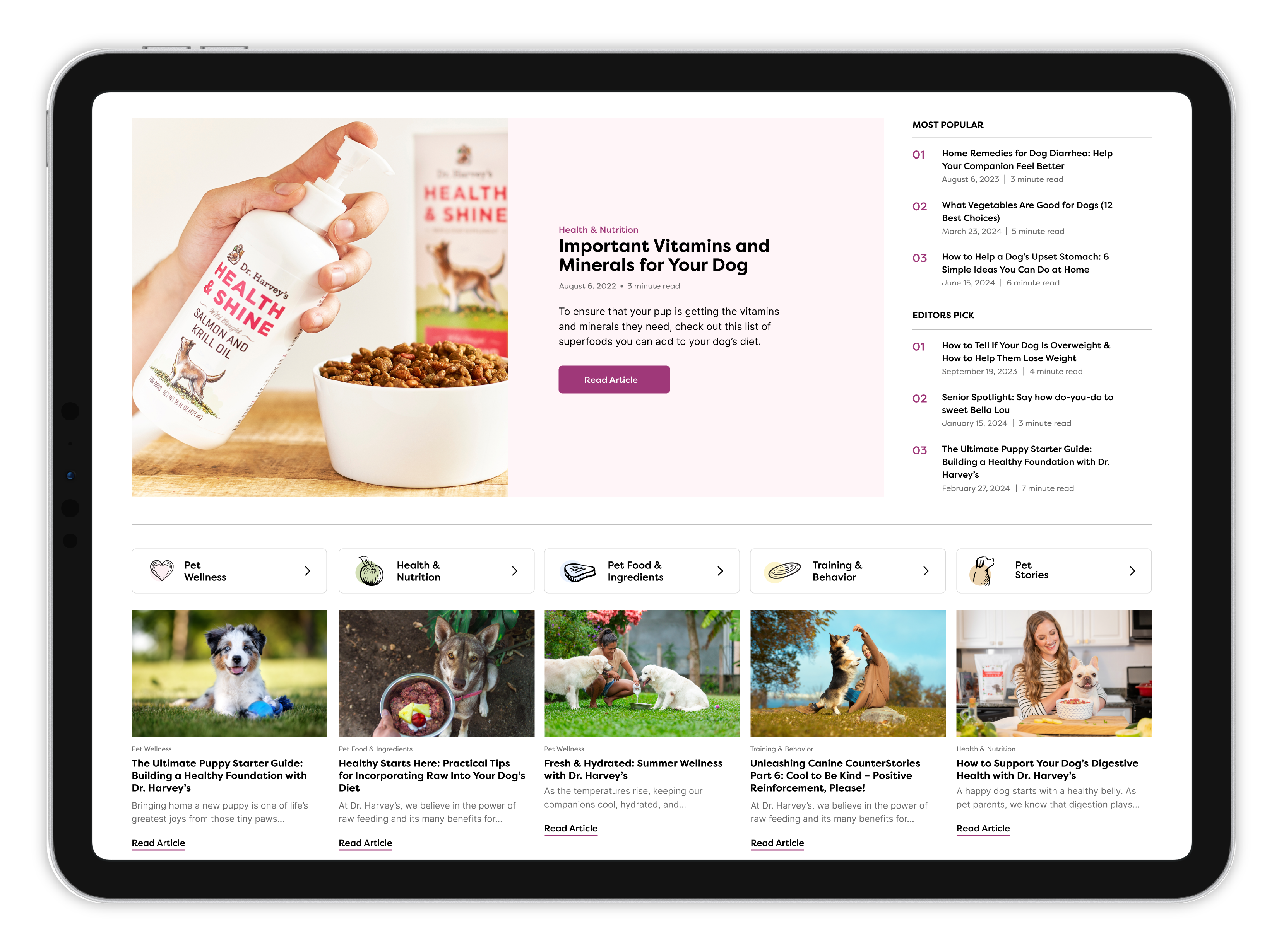
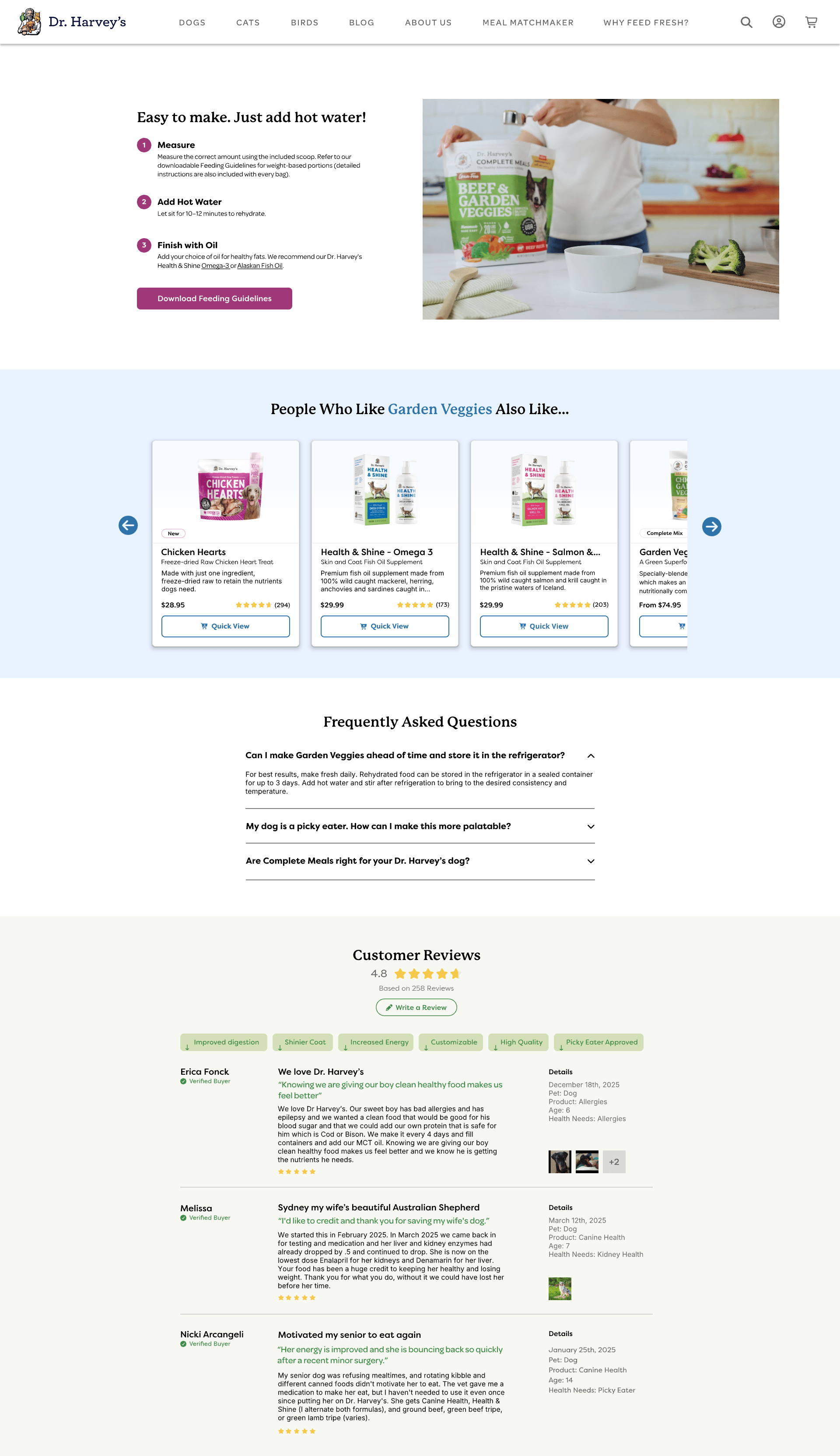
The site needs to educate without overwhelming. Clear visuals, step-by-step instructions, and real examples can reduce confusion and help users feel more confident about using the product correctly.

Sales Without Gimmicks

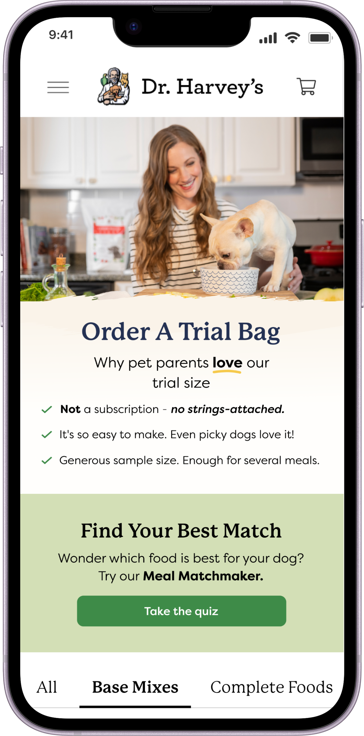
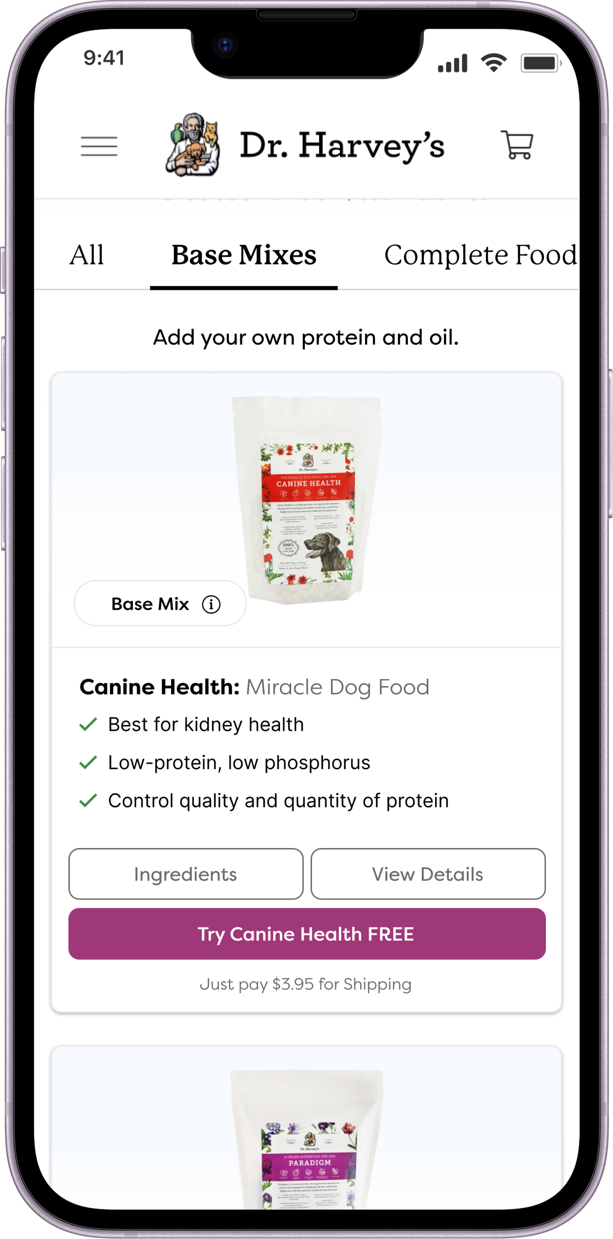
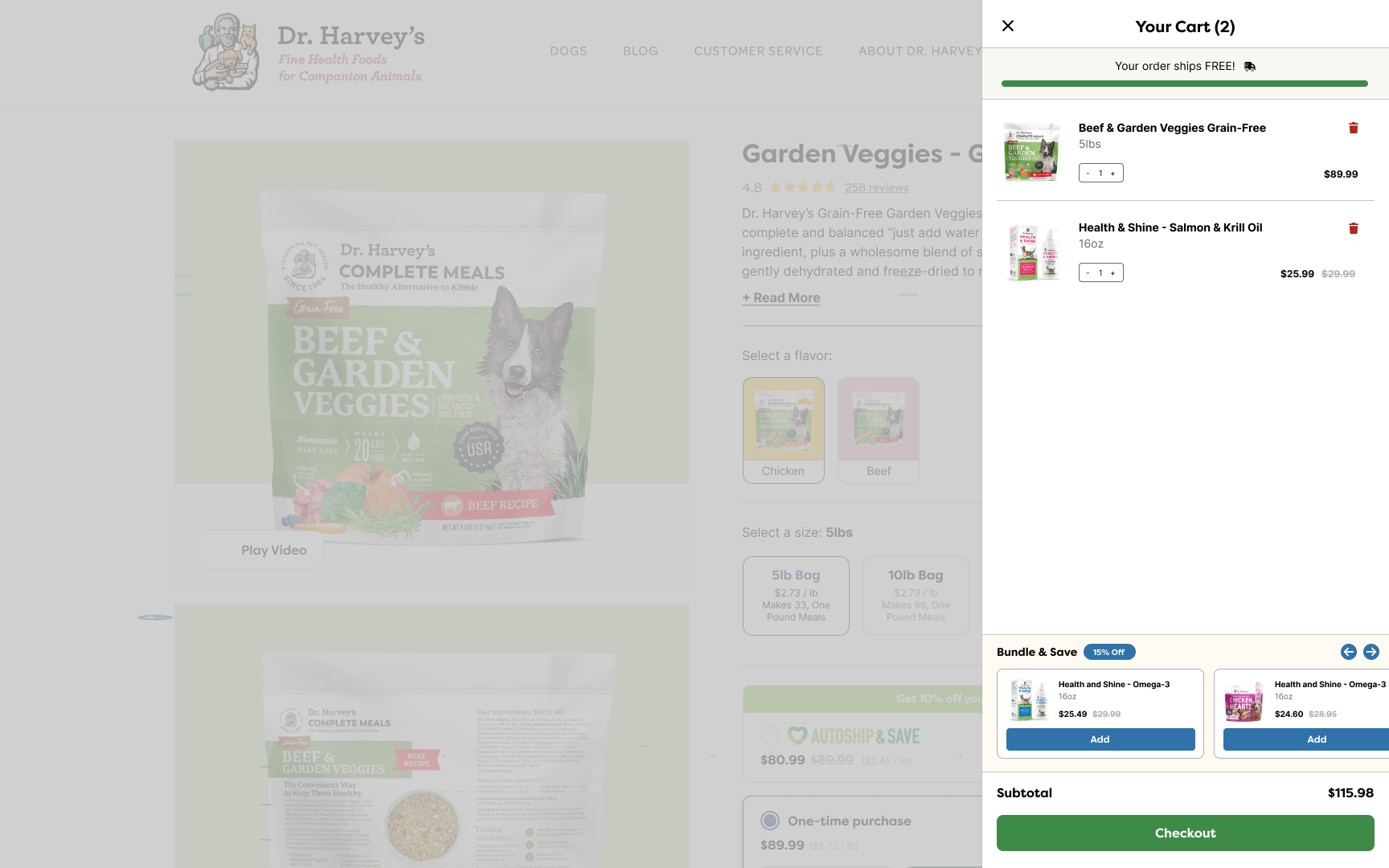
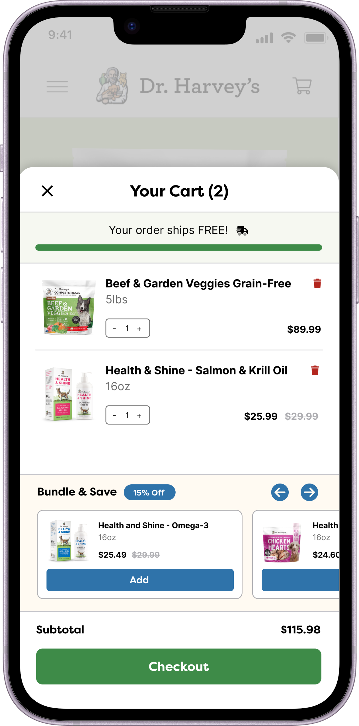
The goal was to boost trial sign-ups and sales while staying true to Dr. Harvey's transparent, no-gimmicks approach. This meant designing persuasive flows (like upsells and cart nudges) that felt honest, not manipulative.
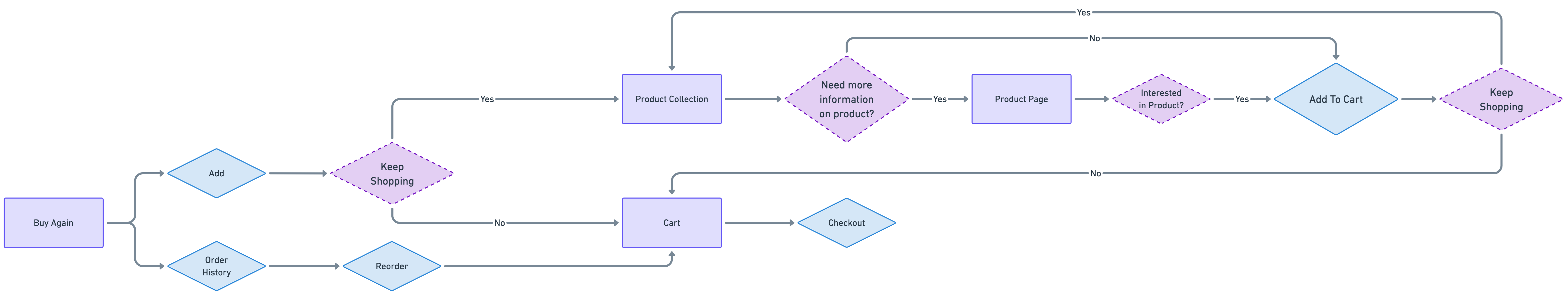
Usability

The site needed a clear, frictionless checkout and account experience on all devices — making it easy to reorder, try new products, or manage auto-ship, without confusing interfaces or hidden barriers.

Objectives

Revewing project goals

While the primary business objectives centered on maximizing user conversion and generating leads by clearly communicating the functionality of the application, we successfully identified the areas where these objectives intersected with that of users by using our research into Island Finance's customers.

Our goal was to enhance customer service by thoroughly reimagining and rebuilding the user journey based on Island Finance's user needs. We sought to position the company as a friendly and trustworthy partner in digital personal loans. The team's mission was to empower users to make informed financial choices and monitor their finances effectively, ultimately enhancing the overall quality of life for customers while still fulfilling the business's goals.

Features

Transforming needs into features

Based on the user needs identified during the empathizing phase, we decided to focus on a few key features to enhance customer's experience.

Redesigned Product Pages

Detailed but scannable pages that lead with ingredients, sourcing, and feeding instructions, making it easy for research-driven buyers to find what they need and convert.

Trial Landing Page

dedicated page offering a low-commitment entry point for new buyers, lowering the barrier for first-time customers who are curious but not ready to commit to a full order.

Autoship

A seamless recurring order setup that rewards loyal customers with savings, keeping retention high among buyers who already love the product.

Cross-Sell Moments

Personalized prompts at the cart and checkout stage that surface complementary products like supplements or treats, increasing average order value without feeling pushy.

User Flows

How users shop for dog food

To design an experience that actually works for dog owners, I needed to understand how they shop, what they know walking in, what they're unsure about, and where they might get stuck. Mapping these flows helped ensure every path feels intuitive and leads to the right food for their dog.

Browsing through navigation

Shopping by best sellers

Shopping by personalized recommendations

Returning to buy again

Design

Design System & Style guide

High-fi Wireframes

Introducing Dr. Harvey's

A refreshed experience built around clarity, warmth, and ease, guiding pet parents through intuitive paths, straightforward choices, and helpful information exactly when and where they need it.

Designing the First Impression

Whether someone is visiting for the first time or returning to reorder, the experience was designed to feel clear and tailored from the start. New and returning users are met with entry points designed around their needs. First-time visitors are eased into what fresh feeding is all about, while returning users can quickly pick up where they left off. This structure keeps the journey intuitive, building familiarity and confidence that makes it easy to move from exploration to action.

Education & Trust Building

Pet parents exploring holistic nutrition usually have a lot of questions before they're ready to buy. These pages are designed to meet them there, bringing together education, brand values, and real customer stories in a way that feels honest and reassuring. By the time someone finishes exploring, the goal is that they feel informed enough to take the next step with confidence.

Product Discovery

The discovery experience was designed to make choosing feel simple. The Meal Matchmaker points users toward the right products for their pet, while filtering and clear organization keep browsing stress-free. On the Product Details Page, educational content gives users the context they need to feel good about their decision. Touchpoints like Find a Store round out the experience by offering flexible ways to buy, so no matter where someone is in their journey, the path forward always feels clear.

Guided Conversions

Once a product is selected, the focus shifts to making checkout feel like a natural next step. The Free Trial page offers a low-pressure way in, while personalized upsells in the cart gently guide users toward options that feel relevant rather than pushy. From there, a streamlined checkout keeps things moving smoothly, so by the time someone reaches the final step, they feel confident in what they're getting.